I have used my portfolio site to showcase this test assignment. The case is not visible on the site, and I have put a password protection on it, so that there is no chance for unwanted eyes to see it. The embedded video is an unlisted Youtube video, that can only be seen through this embed or a direct link.
Interesting assignment!
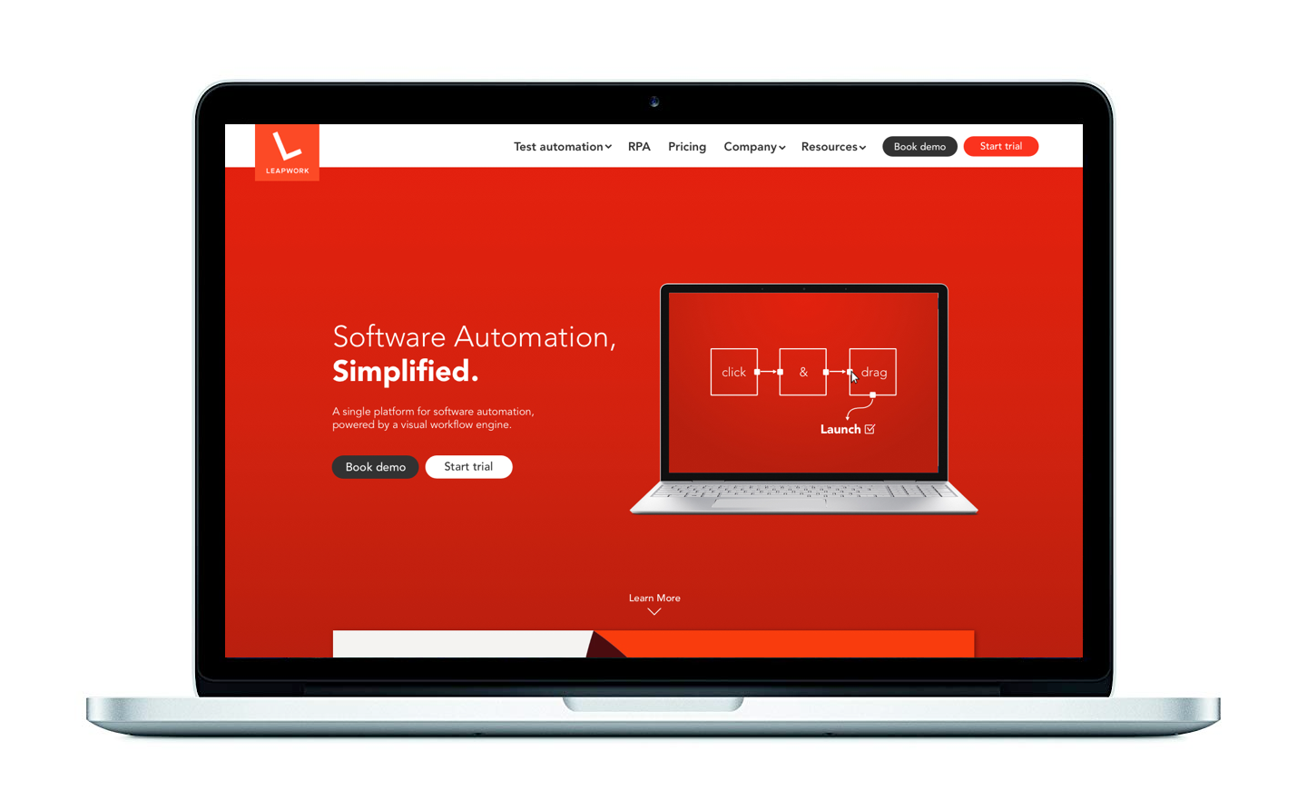
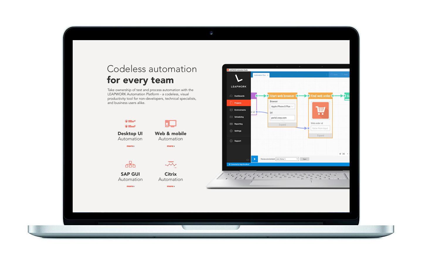
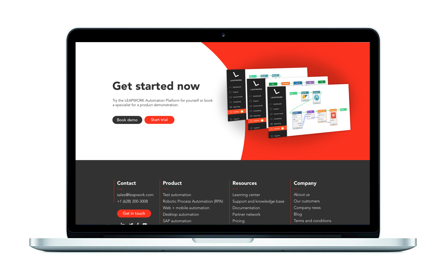
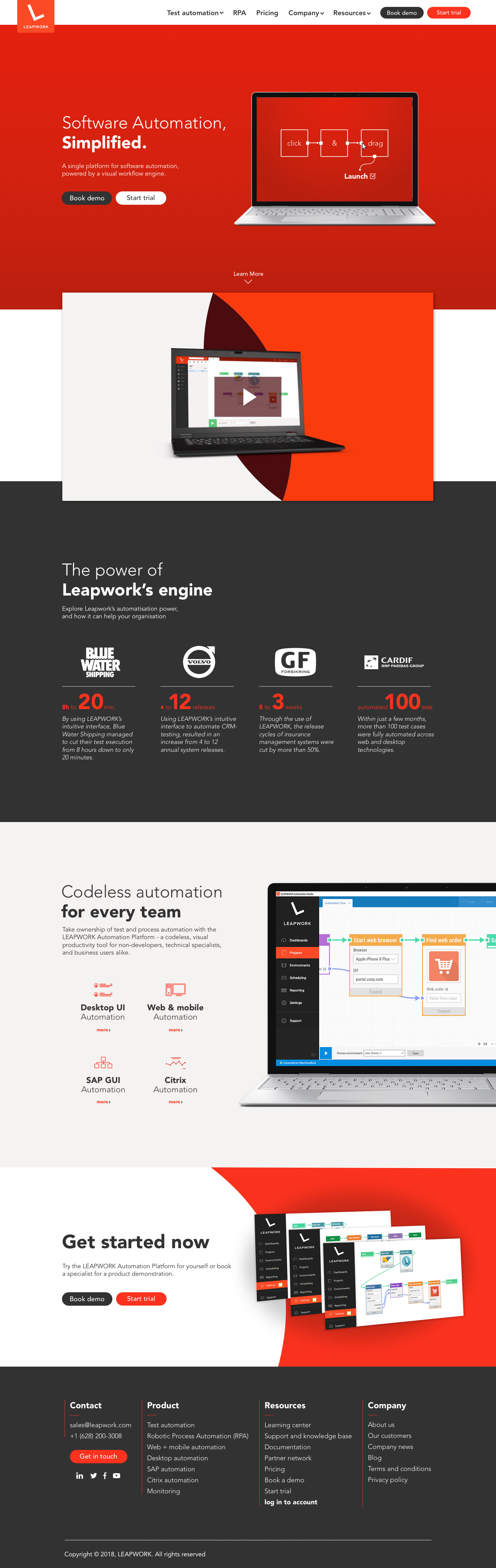
This is my UI suggestion for your front-page. I have started from your existing style, and continued to develop it from there. Overall my aim has been to “slim it up” a bit; using more condensed graphics, adding more white space around objects and using sleek icons. The style is more minimalistic and modern.
This is my UI suggestion for your front-page. I have started from your existing style, and continued to develop it from there. Overall my aim has been to “slim it up” a bit; using more condensed graphics, adding more white space around objects and using sleek icons. The style is more minimalistic and modern.
As your product is (mainly) desktop based, I have chosen to design the desktop version of the site. However the design is built in a way that would easily adapt to mobile.
Your tool is very straight forward once you get to know it, but can be tricky to convey properly when you first see it. Because of this I have simplified the main aspects of the tools interface (just like in your trailer video), to give a more easily understandable idea of how the tool interface is built and works. The main focus is that it is simple, easy to understand and is based on click and drag interactions. I imagine the gif within the computer graphic to animate in on page load and then stay static.
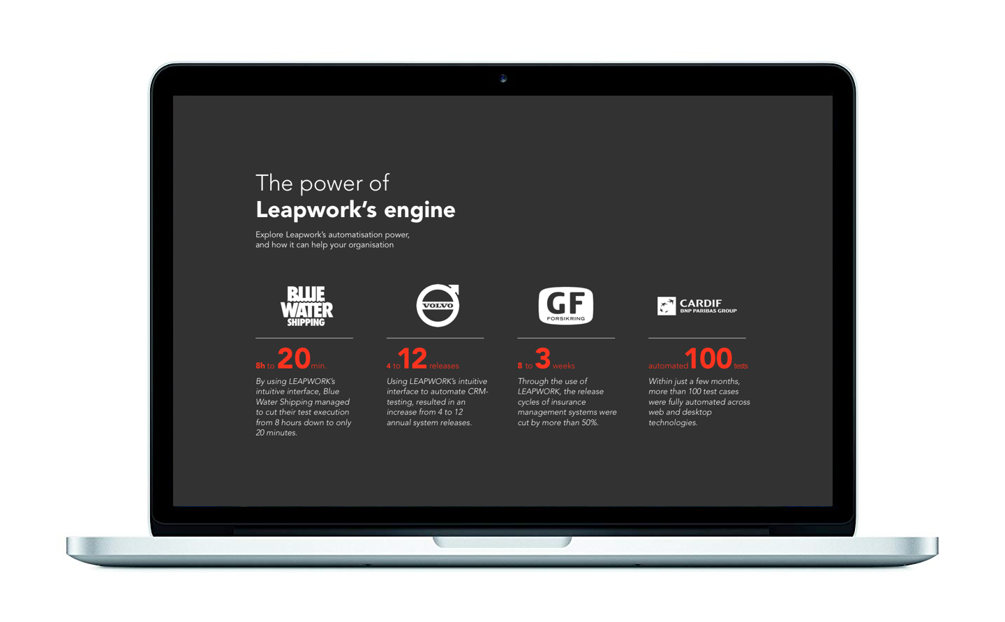
I implemented your sales “one-liners” as four short and concise examples of the great benefits of the tool. Using bold numbers that catch your attention, it is conveyed that by using your software, one can increase efficiency, and save time - and it can actually be measured in numbers and percentages. I imagine the numbers to animate in as a fast counter that ends at the right amount. The tabs transitions in smoothly from left to right.
Click the images to enhance

Thanks!