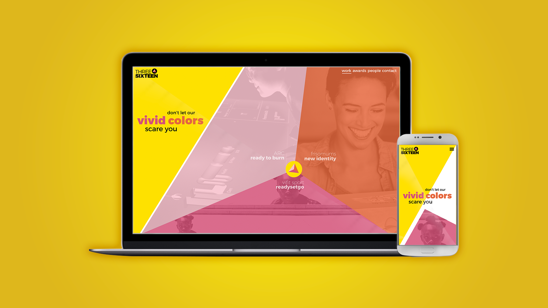
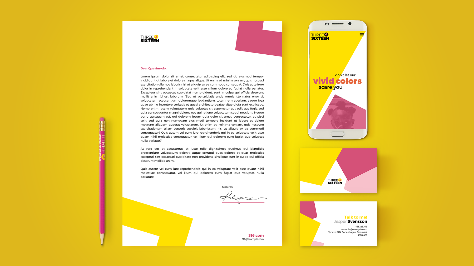
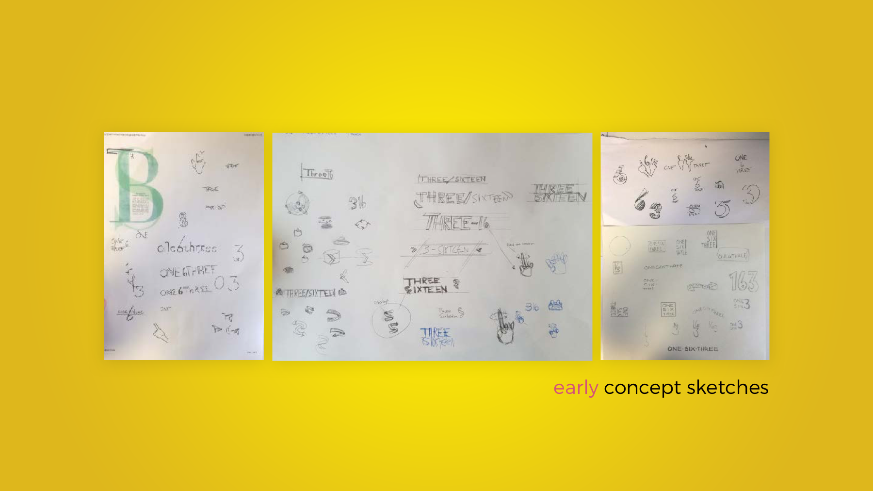
Dive into the identity-creation process of the 316 logo and visual style

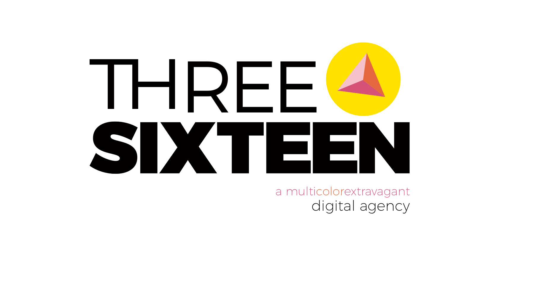
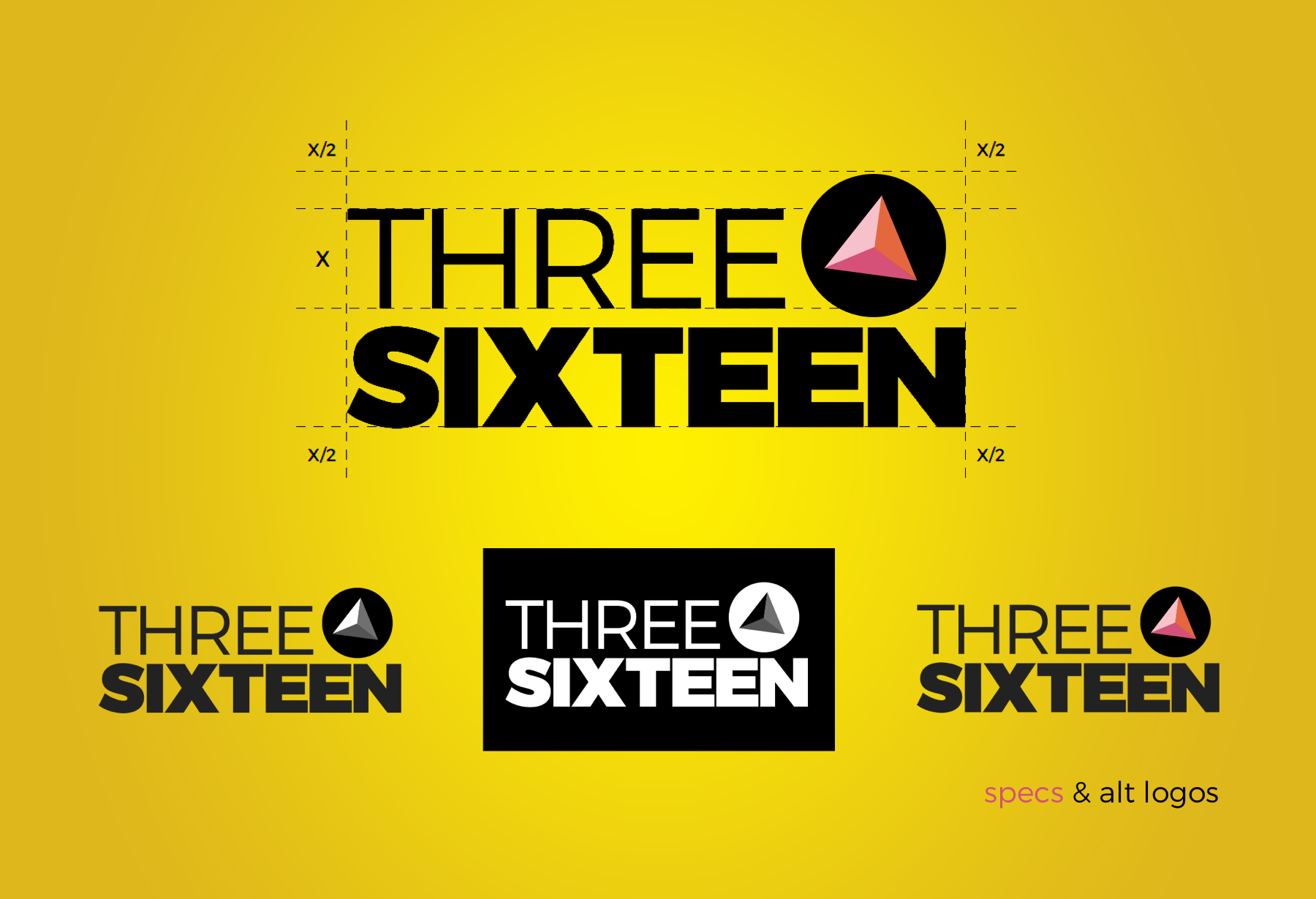
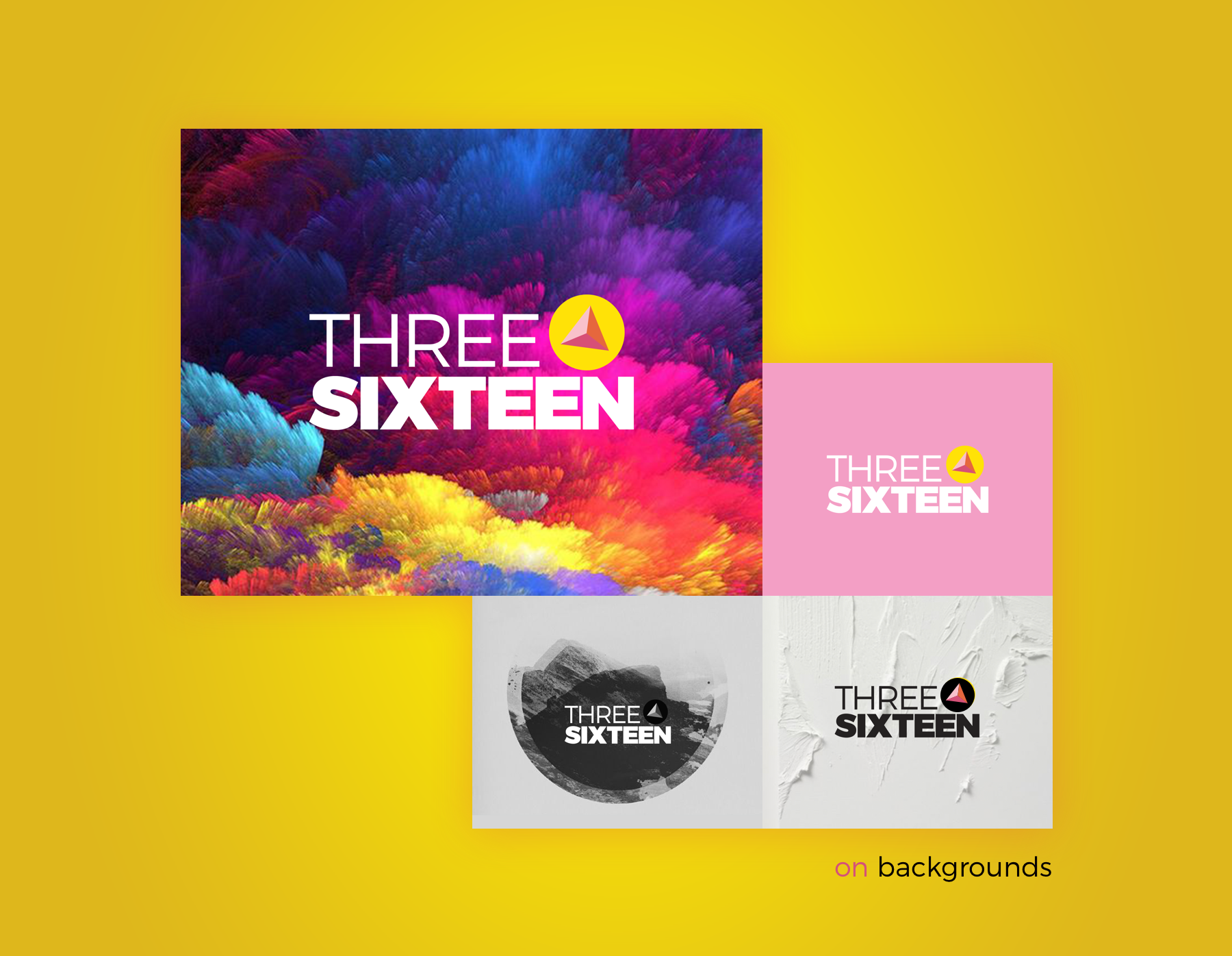
The logo:
The name 316 is based on the date of the first meeting of the agency founders. It symbolises the connection between these people, their goals and their dreams in creating a bold new agency.
The yellow circle visualises the symbolism of “360 degrees” which, the name easily reminds you of. It describes the “all the way around”, “from start to finish”-type of solutions that 316 create for their clients.
The triangle in the logo visualises the first number in the agency name as well as the three dimensional aspect of how the agency work with their clients tasks.
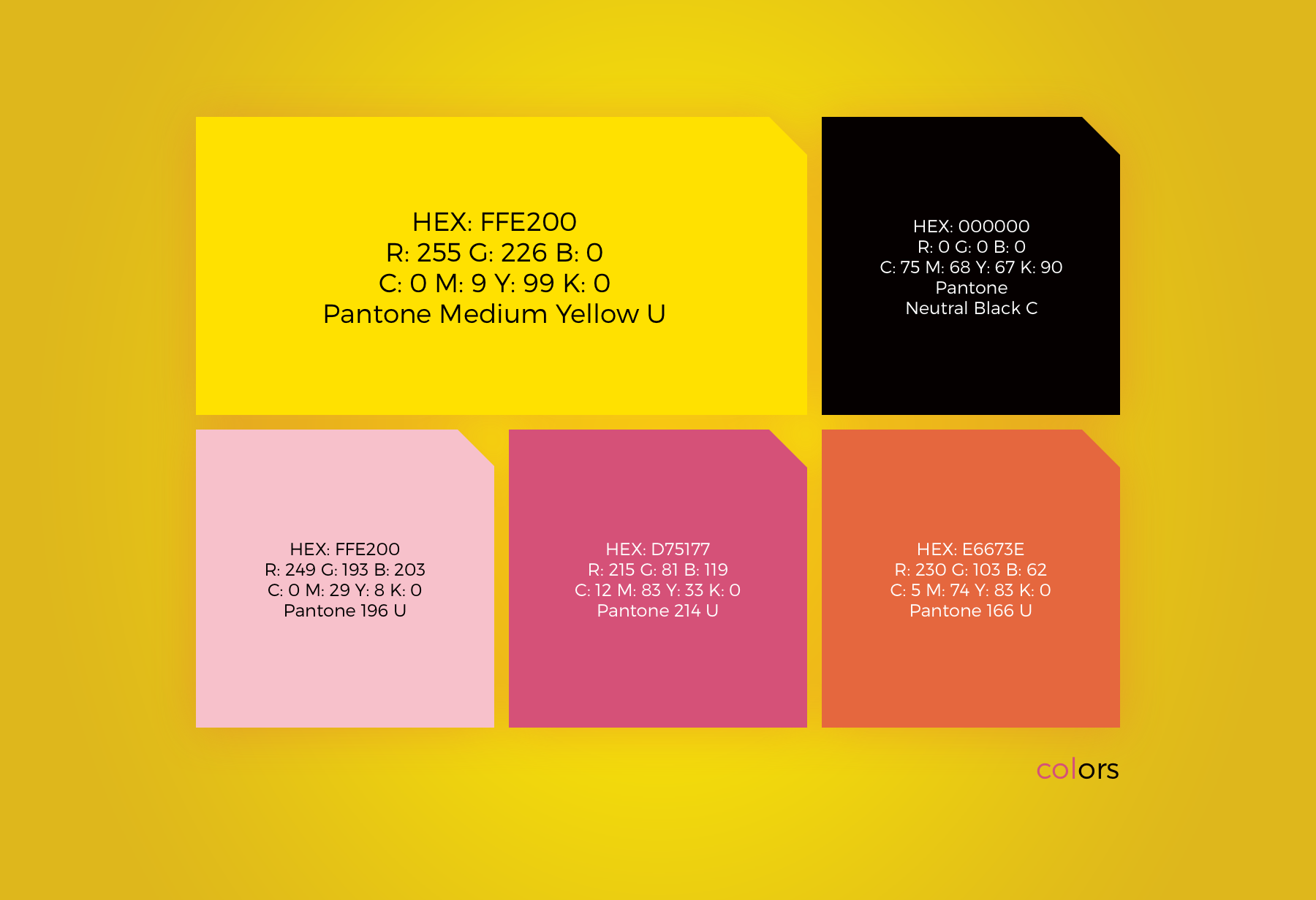
The colour-scheme:
The bright colours, with the yellow in particular, are naturally seen in nature as colours that are meant to notify the beholder, and catch their attention, and in 316’s case, evoke their interest.
Thanks for reading